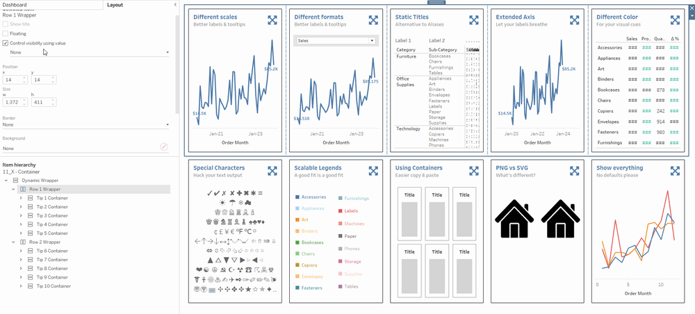
A collection of my frequent dashboard tricks and tips from my work processes. Hope this helps you build a better user experience for your audience!
Back in Sept 2023, in the midst of cleaning my corporate internal processes; I realized there was a couple of things I was doing with every dashboard I created. While I can't share my work stuff, I figured I could repurpose some of these tricks to share with the wider #datafam . That eventually became my #VOTD (which was really exciting) - 10 hacks to bring your dashboard from good to GREAT ! Ever since, I have received many DMs about how to do some of it, so here I am... to break it down :)
⭐ Different Scales ⭐
When dealing with large numbers, one way to increase chart readability is the reduce the label scales to thousands (k), millions (m) or billions (b). However, this causes both the tooltips and labels to share that same scale.
🔎 Breaking it down for you 🔍
- Hold down CTRL (or Command for Mac users) and drag the measure to the tooltip mark
- Double-click on the measure to go into quick calculation edit, and add a "/1"
- Right-click and select Format, and change to your desired style in the Pane window
- Use the modified measure in your tooltips
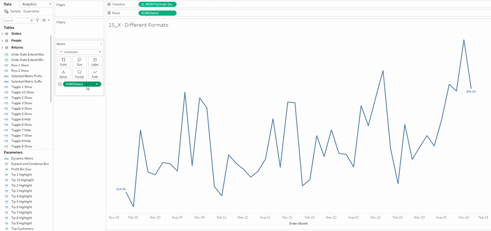
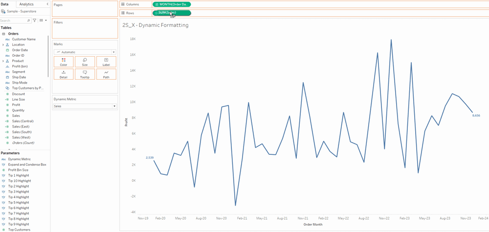
⭐ Different Formats ⭐
While you can create a parameter to allow dynamic measure selector, Tableau doesn't have an automatic way to assign the proper formats (#, $, %) to it. One way to hack this is to create two calculated fields - prefix and suffix; and add those into the labels and tooltips as well.
🔎 Breaking it down for you 🔍
- Create a parameter with a list of all the metric names you want the user to select from
- Create a calculated field with a CASE or IF/ELSE to check the parameter, and change to the intended measures
- Create a calculated field for prefix to cater for measure with $
- Create a calculated field for suffix to cater for measures with %
- Add the prefix, dynamic measure and suffix (in that order) to your labels/tooltips
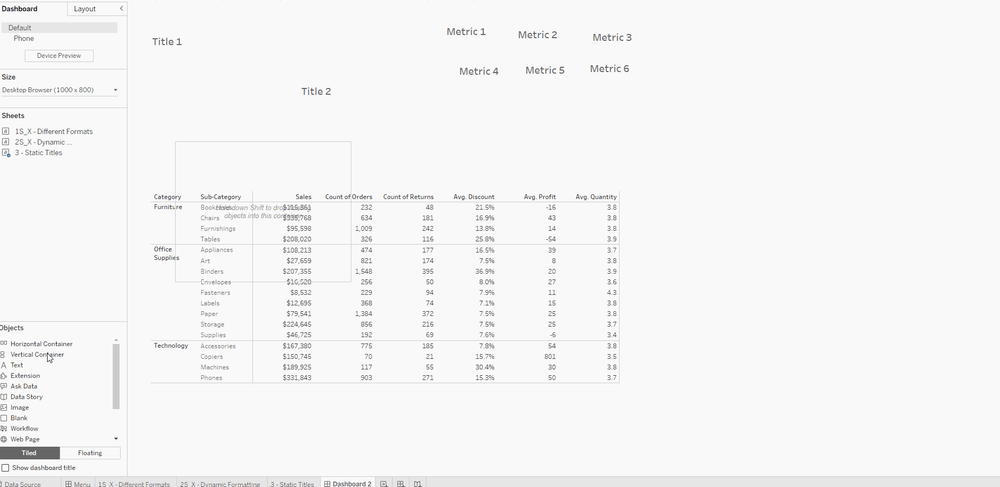
⭐ Static Titles ⭐
When you have different calculations of the same measure in the same table, the measure names may become convoluted and hard to manage. While you could technically use the Alias to assign an alternative naming, you can't reuse the same name for different measures. Another way is to name the measures as how you want it to appear, but that becomes challenging as the number of measure names increases too. What I suggest is an easy hack - to use a container with multiple text objects. Do ensure that you keep the measure titles within a horizontal container and have it distribute equally, as that's the same methodology Tableau uses for its crosstab.
🔎 Breaking it down for you 🔍
- Create the total number of dimension titles and metric titles as text object. In the example above, I created 2 titles and 6 metrics.
- Put the 2 dimension titles into a Horizontal Container (H1)
- Put the 6 metric titles into a Horizontal Container (H2) and set it to distribute equally.
- Put H2 into H1, just right of the last dimension title
- Put H1 and your table worksheet into a Vertical Container (V1)
- Adjust the dimension titles width to match the table dimension title's width. You don't have to adjust the metric title width.
- Hide the header by right-clicking and deselecting "Show Header". Right click on the table's dimension titles and select "Hide Field Labels for Rows".
⭐ Extended Axis ⭐
Particularly when you're building sparkline charts, it's usually good practice to label the first and last values, to provide some context to your users. However, the default axis does not factor in the length of your labels and may truncate or overlap the values with the trend lines. One way you can hack this, is to extend the axis range by incorporating a fixed LOD calculated field of your time dimension, and add it to your axis as reference lines. Be sure to set the line colors to None so it appears invisible to your users.

🔎 Breaking it down for you 🔍
- Create a FIXED Level of Detail calculation of your axis dimension's minimum value with your desired padding (use DATEADD). In this example, we are using Order Date so the formula will be { FIXED : MIN( [Order Date] ) }
- Create a FIXED Level of Detail calculation of your axis dimension's maximum value with your desired padding (use DATEADD). In this example, we are using Order Date so the formula will be { FIXED : MAX( [Order Date] ) }
- Add both calculated fields into the detail. Tip: Hold down the right mouse button to drag (instead of the left) so Tableau doesn't aggregate it to lowest granularity (i.e. Year)
- Right-click on the axis and add Reference Line. Change the value to your calculated fields and set the Label, Tooltip, Line to None.
- You will need to add 2 reference lines - one for the left padding (minimum) and one for the right padding (maximum)
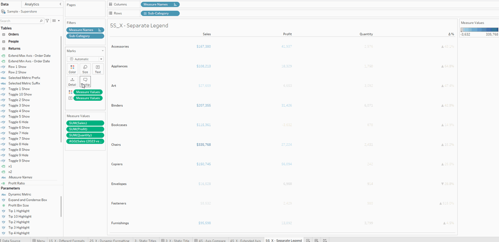
⭐ Different Color ⭐
Did you know you can assign different colors to measure values? This trick is very useful for defining the negative and positive ranges for different measures, and helps to prevent the extreme values from skewing the color coding. In order to do this, you can right-click on the measure values and select use separate legends. After which, you can modify the color range of each measure.
🔎 Breaking it down for you 🔍
- Put Measure Values into the Colors mark, right-click and select "Use Separate Legends"
- For values that don't need any coloring:
- Set the color to black (or any color you desire)
- Click on "Advanced >>" and set the "Start" and "End" to 0
- For values that need a positive and negative color:
- Select "Custom Diverging" and set the colors you desire
- Set the "Stepped Color" to 2 steps
- Click on "Advanced >>" and set the "Start" to -1, set the "End" to 1, and set the "Center" to 0
⭐ Special Characters ⭐
Unicode characters are extremely useful to add text manipulation and introduce simple iconography. Some of the most commonly use cases are:
- Using arrows to add visual cue to positive (▲#,##) or negative (▼#,##) numbers.
- Using blank unicodes (U+2800) to hack Tableau's limited spacing and break lines.
- Using emoticons to add design styles and leverage on pre-attentive attributes.
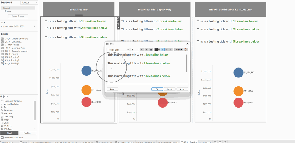
🔎 Breaking it down for you 🔍
- Tableau doesn't process breaklines the same way as text, and the amount of height/width given to it is much lower than a normal character. You can hack this by explicitly putting a space and formatting it the same way as you did for the other characters, or insert a blank unicode. Both ways work but the unicode is much easier to see when you're troubleshooting and trying to align texts.
- You can also use geometric shapes like a triangle and upside down triangle to indicate positive and negative values. This is often used for KPI cards to create that additional visual cue.
- There are more unicodes like emojis, shapes, etc; and you can explore the full range over at this dashboard created by Tableau Extensions team.
⭐ Scalable Legends ⭐
Tableau's default legends are not scalable and often requires a precise manipulation (i.e. sizing, floating). You can create your own legends using a box unicode (■), but you would still require a lot of manual adjustments. By using a INDEX() calculated field that computes along your selected dimensions, you can create a legend using square marks and labels that resizes automatically.
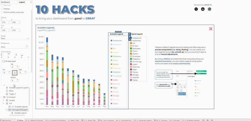
🔎 Breaking it down for you 🔍
- Create a new sheet and drop the dimension into the Color Mark
- Double-click on the Row shelf to add a new quick calculation INDEX(). Right-click on the calculation, edit Tableau calculation, and set it to a the specific dimension you have.
- Add the dimension to the Label and align it to the Middle Right
- Change the marks type to Square
- Double-click the Column shelf to add a new quick calculation MIN(0.0)
- Hide all axis
⭐ Using Containers ⭐
Building dashboards can take a lot of time, and often requires recreating containers as well as formatting them (i.e. padding, background, size). The copy/paste feature for dashboard items was introduced in 2021.4 but there are limitations to it, especially when it comes to dashboard iteration. This feature will not work if there's an existing sheet within the container you are trying to copy. However, you can create templates using containers with colored blank objects as placeholders. These containers will keep all padding and sizes within its nested structure; and you can duplicate these as many as you'd like, to accelerate the dashboarding process.
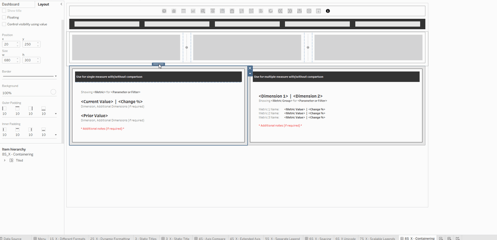
🔎 Breaking it down for you 🔍
- Right-click on any dashboard element (except worksheets) and select "Copy Dashboard Item".
- Press Ctrl+V (or Command+V for Mac) to paste, or use the File Menu > Paste to paste the copied item.
- Drag and reposition your new item
⭐ PNG vs SVG ⭐
When using images on your dashboard (especially as navigation buttons), do use SVG instead of PNG as the former has a smaller file size, and is pixel-perfect no matter how you resize it. For PNG, it depends on what size it was initially created and if you try to size it larger than the original file; it starts to get a little blurry and pixelated. However, do note that SVGs are still not accepted when using them as custom shape marks (C:\Users\Documents\My Tableau Repository\Shapes)

🔎 Breaking it down for you 🔍
- You can easily create a SVG in most available tools:
- PowerPoint > Right-click, save as picture and explicitly selecting SVG
- Figma > Export and select SVG
- Downloading the SVG version from repositories like Noun Project
⭐ Show everything ⭐
Tableau's default behavior when a visualization is granularized by a dimension, is that the tooltip will only show the value of that particular dimension value upon hover. However, you can force Tableau to show all values (which could be useful as additional context to your users) by creating as many Level of Detail (i.e. Fixed, Include, Exclude) calculated fields as your dimension's unique values. You can use a combination of excluding that dimension in the fixed LOD, and an IF/ELSE statement to filter a specific dimension value in the aggregation.

🔎 Breaking it down for you 🔍
- Create a EXCLUDE Level of Detail calculation of your desired dimension so that it ignores the granularity in the line charts. In this LOD calculation, you will have to specify the dimension value you are trying to aggregate by explicitly calling it out using a IF statement. The full calculation will look something like this (e.g. I want to get the Furniture sales, but ignoring the Categoory granularity in the line charts)
- { EXCLUDE [Category : SUM( IF [Category = "Furniture" THEN [Sales] END ) }
- Create the same calculation for the other dimension values - Office and Technology
⭐ BONUS: Expand/Hide Containers (DZV style) ⭐
One of the common questions I get for this dashboard is "How did you get the containers to expand and contract?". Back in 2022.3 - which was released in Oct 2022, Tableau introduced the Dynamic Zone Visibility feature. This was a huge step up from the traditional Show/Hide containers we were used to as it allowed you to use Boolean values (i.e. True/False) to control the visibility of any element in the dashboard. It is still one of my favorite Tableau features to date.
So the idea is that I needed the individual 10 tips container to fill up the entire space when it's expanded, and have each of them tiled when it's collapsed. Seems pretty easy right? Except you really need to get the container-ing right!

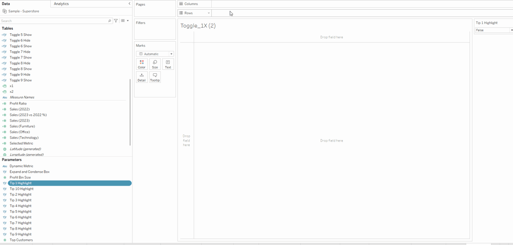
🔎 Step 1 - Creating the parameters and calculated fields 🔍
- Create 10 Boolean-type parameters
- Create 10 Toggle calculated fields that checks that every other parameter except the one you want to highlight is FALSE
- Create 2 Row calculated fields that checks if the entire row is FALSE (i.e. 1,2,3,4,5 or 6,7,8,9,10)

🔎 Step 2 - Creating the containers 🔍
- Create a Vertical Container (i.e. Dynamic Wrapper above) as the master to put everything in. Quick Tip: Put a Blank object inside the container to make it easier to drop items in it, and remove the blank objects later. Also, it's much easier to work with containers (especially in the configuration stage) to have it as floating.
- Create 2 Horizontal Containers to house the two rows of cards
- Create a Vertical Container for each of the Tip.
🔎 Step 3 - Setting up the visibility values to the containers 🔍
- Link up the Control Visibility using Value feature with the Toggle-type calculated fields you have created above. (i.e. Toggle 1 checks FALSE for Tip 2-10)
- Link up the Control Visibility using Value feature with the Toggle-type calculated fields for each row group.
🔎 Step 4- Setting up the actions🔍
- Add a MIN(0.0) to the Row Shelf
- Change the Marks to Shape type, and drag the Tip 1 Parameter to it. For additional formatting, you can drag the parameter to Color as well.
- Change the shape to something appropriate (You can get a lot of icons from Noun Project)
- Change the parameter manually to change the True / False shapes
- Add the Tip 1 parameter to the Detail mark, and double-click to add a quick calculation to " NOT [Tip 1 Parameter]
- Create a Change Parameter action (Worksheet/Dashboard):
- Target Parameter > Tip 1 Parameter
- Source Field > NOT [Tip 1 Parameter]
- Repeat the process for Tips 2 - 10 and add all these sheets to your individual Tip Container
❓ How this works is: ❓
- When the user interacts with the sheet with the Tip parameter Shape, the inverse value of the boolean gets set. True becomes False and vice versa.
- All 10 Tip parameters work the same way, and the Toggle calculated fields check each of the parameter values
- Based on the condition and value in the Toggle calculated fields, the containers get set to visible or hidden
- Also, one more tip for the individual Tip container:
- Elements with fixed width or heights retain the same size when expanding/collapsing
- Elements without fixed width or heights get stretched to the rest of the width/height (sans the fixed elements)
So there you have it, a full breakdown of the 10 hacks to bring your dashboard from good to GREAT. Hope you find it useful, and feel free to reach out if you still have any queries :)